Folly Jazz Series>KCAI 2018
KCAI Student Interview: Madison Hollingsworth
Madison Hollingsworth
Age: 21 | Field of Study: Graphic Design
[caption id="attachment_5400" align="aligncenter" width="640"] Madison Hollingsworth. Yellowjackets poster winner.[/caption]
What were your honest thoughts when you heard about this project?
"I had a whirlwind of thoughts when I first heard about this project. I was immediately hit with a wave of excitement, as this was the first chance that I got to design something for an organization that wasn't my family or friends. Although I was excited about the opportunity, I was also really nervous; I just wanted to reflect these artists in the best way I could."
Who is your favorite artist that you listened to?
"All of the artists are incredibly talented! As a person who previously had spent little time with jazz music, I was pleasantly surprised after listening to the artists on repeat for a few weeks, how much I grew to love the sound. The group that spoke to me the happens to be the Yellowjackets [whom she designed the winning poster for]. When I learned that my poster for the Yellowjackets got chosen, I couldn't help but do a little happy dance!"
What was your process for creating your posters (in terms that us non-graphic design students can understand)?
"My process began by doing research on each group, to get more familiarized with their roots, their overall vibes, and what they were all about. Next, I simply listened to each artist's music, and I did so through the course of a few weeks. I jotted down feelings that were provoked directly from the unique sounds of each group and just ran with those feelings. Before the finished designs, hand-drawn sketches were essential. There were many, many iterations before landing on the final posters. Each poster is individualized as well as keeping some similar characteristics throughout such as the placement of the date and time, and the illustrative qualities that I focused on. I used three Adobe programs for different steps of the design process; Illustrator to manipulate the text and complete my illustrations, Photoshop to add textures and patterns, and InDesign to make sure everything was in the right spot and aligned properly."
Of your posters, which is your favorite?
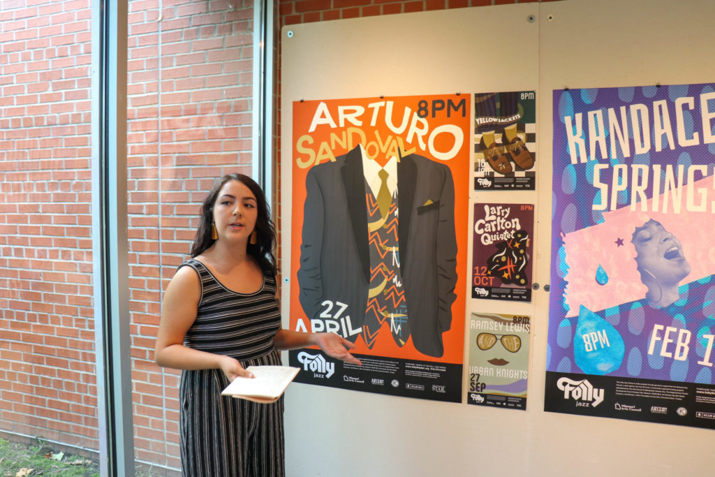
"Out of my 4 posters, my favorite is actually the one I did for Arturo Sandoval. I did a lot of research on Arturo and felt that a suit reflected him in the most truthful way. His is very classy and respected so I wanted to showcase those attributes somehow. I added the pattern in the vest to reflect the spunky feeling of his music. The bright colors used are inspired by Cuban architecture, as Arturo was born in Cuba."
Where are you hoping your career will go after KCAI?
ANYTHING ELSE YOU’D LIKE TO SHARE?
"I take tremendous pride in my work and my designs. It has been a truly exciting and humbling experience to have my work chosen out of a plethora of posters by my classmates to be displayed for a part of the Folly Theater Jazz series. I couldn't be more thankful! Be sure to look out for my Yellowjackets design!"
Where can we find your work?
Instagram: @littlegypsydesigns
[gallery columns="2" size="large" ids="9597,9598,9599,9600"]
